A comprehensive overhaul of The Warhol’s website, including backend CMS, frontend design, information architecture, content strategy, and more
Overview
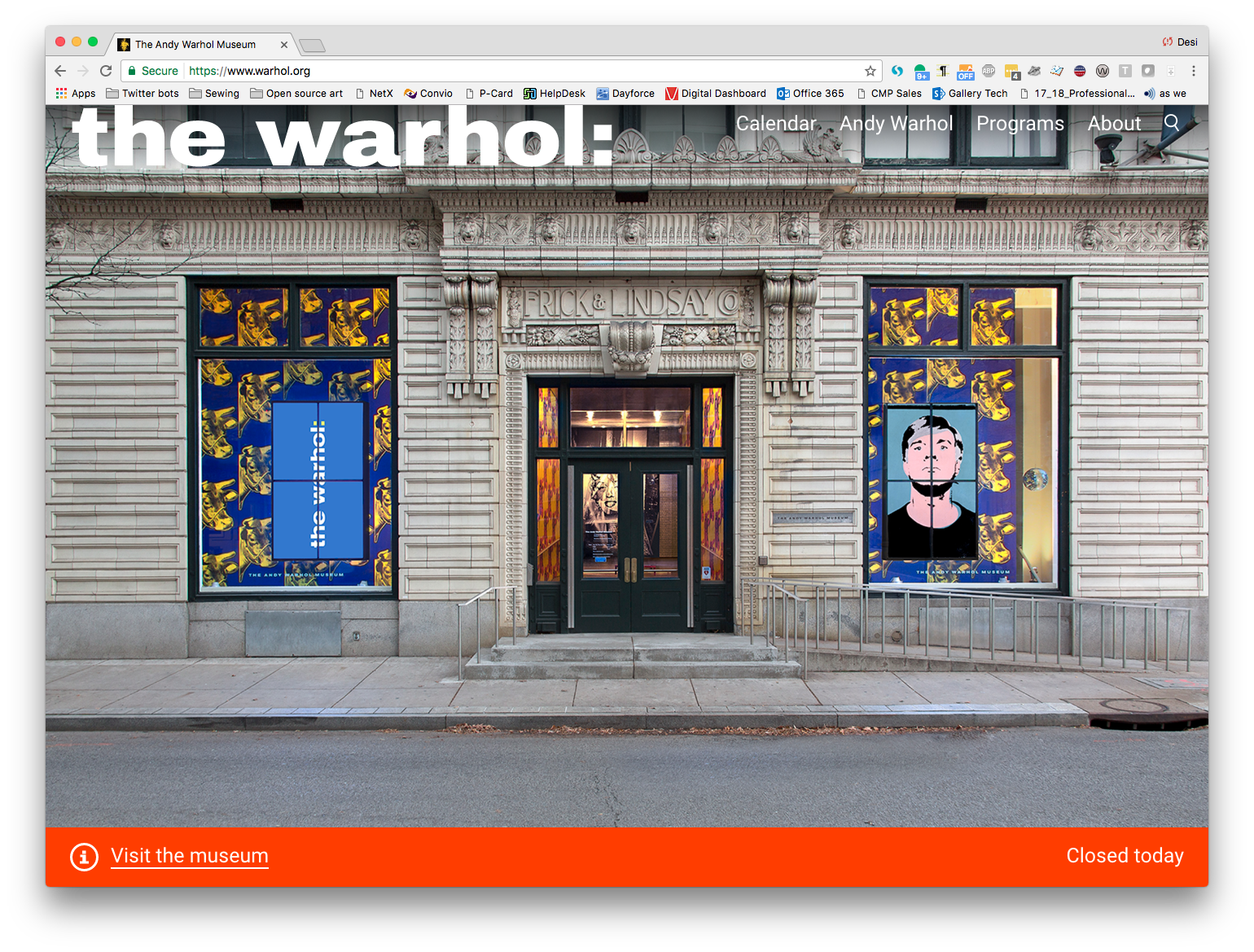
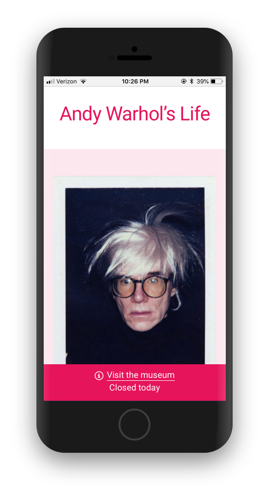
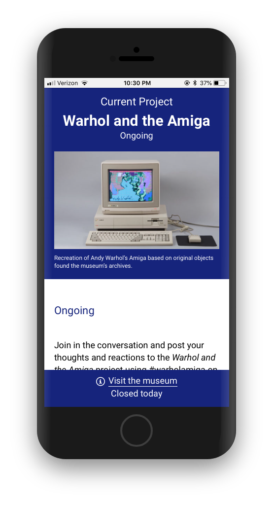
In 2017, we reimagined The Andy Warhol Museum’s website from top to bottom. The new warhol.org is conceived primarily as a communications tool for audiences planning to visit the museum or attend a program, with a secondary goal of providing much sought-after content on Warhol to digital visitors across the globe.The mobile-first design relies on bright colors, expressive typography, and images of visitors engaged in art making and art viewing. The homepage has been reimagined to highlight the unique, active experience of being at The Warhol: as a visitor, you can make art in our Factory studio, play with floating pillow-shaped balloons in the Silver Clouds installation, or star in your very own screen test. The new site also highlights the rich work and life of Andy Warhol through sections like Andy Warhol’s Life and our online curriculum.

The main goals of the redesign were to:
- Implement a modern backend that would allow for growth in the future
- Have a beautiful, simple, user-friendly design
- Rethink our information architecture, pare down content, and implement a digital content strategy
- Be accessible and inclusive of visitors of all abilities, adhering to (and surpassing) WCAG 2.0 AA standards
- Implement editorial processes for content
- Take into account intellectual property limitations
- Centralize our web presence
Team
- Spellerberg Associates, development
- Everything Type Company, design
- Prime Access Consulting, accessibility specialist
I served as product manager and user experience lead, leading a core team of three and working with staff across the museum to redesign the site.
Approach
To inform the redesign warhol.org, we used a number of research methods including analytics, personas, journey mapping, and usability testing. We also conducted a content audit and card sorts to develop our content strategy and new information architecture.
Deep dive: Audience pathways
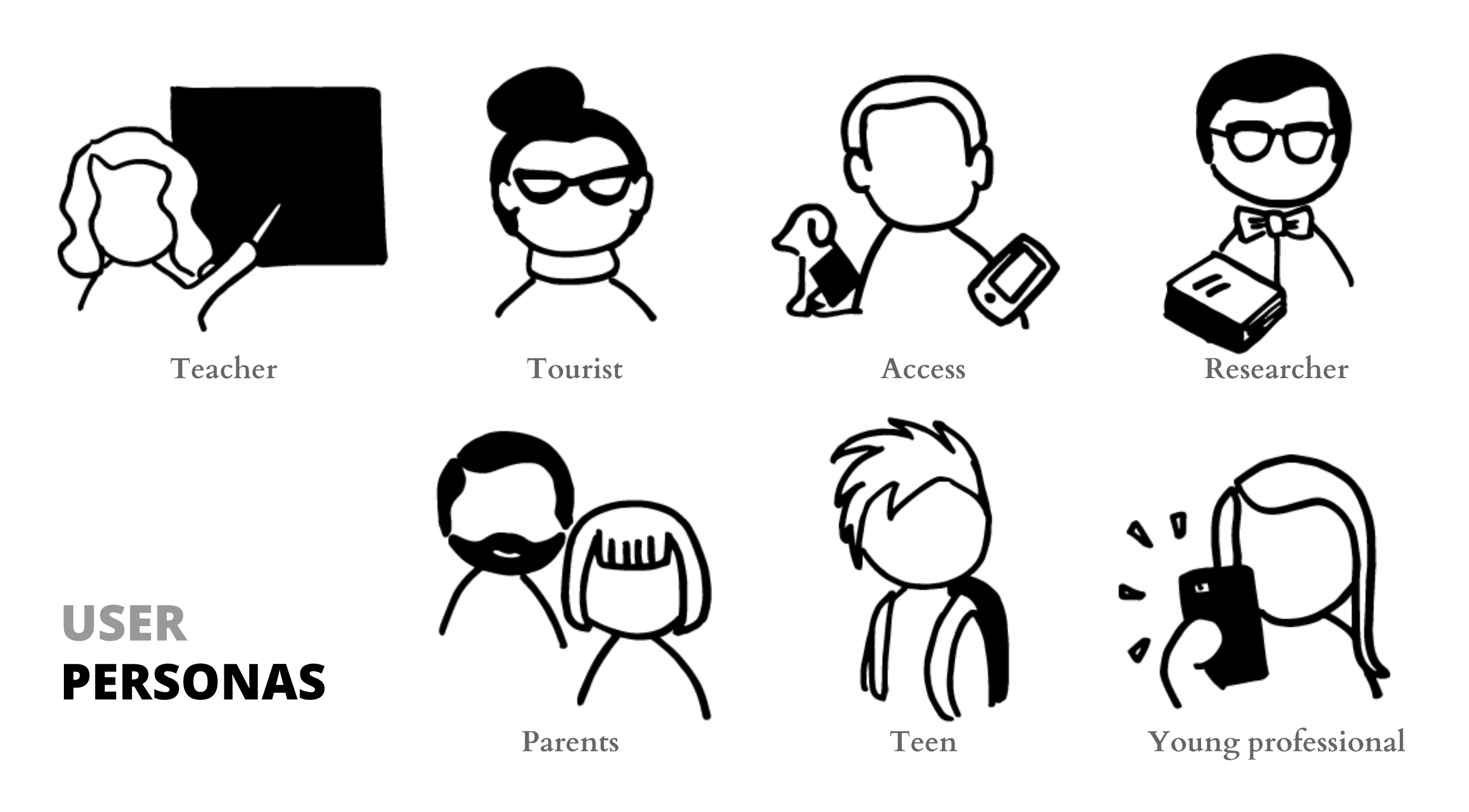
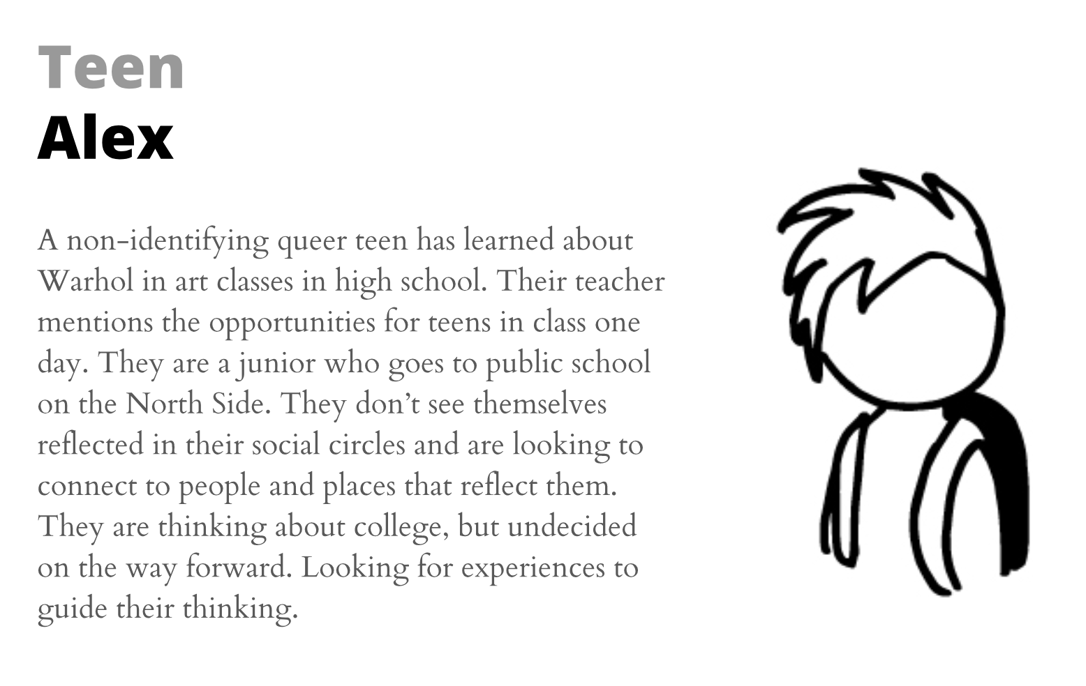
Whether planning to trip to the museum with the family or scheduling a visit to research in our extensive archives, users to warhol.org come to the website with a wide variety of needs. Early on during the discovery phase, we created 7 personas representing typical users as well as those users we hoped to attract. We then mapped the journeys on the old warhol.org for each persona, revealing pain points and areas for improvement.
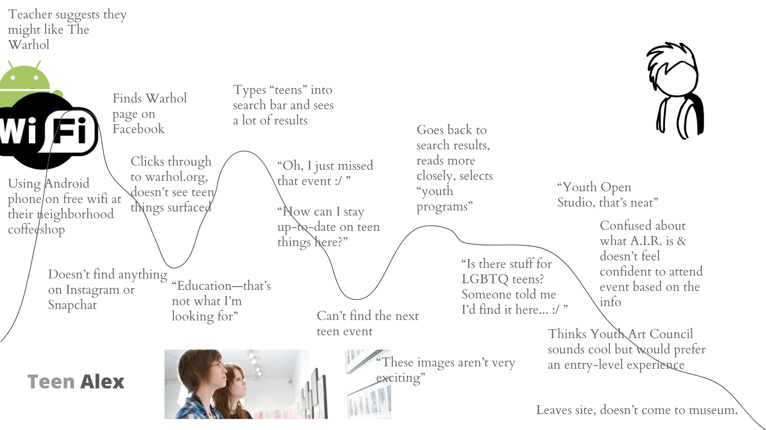
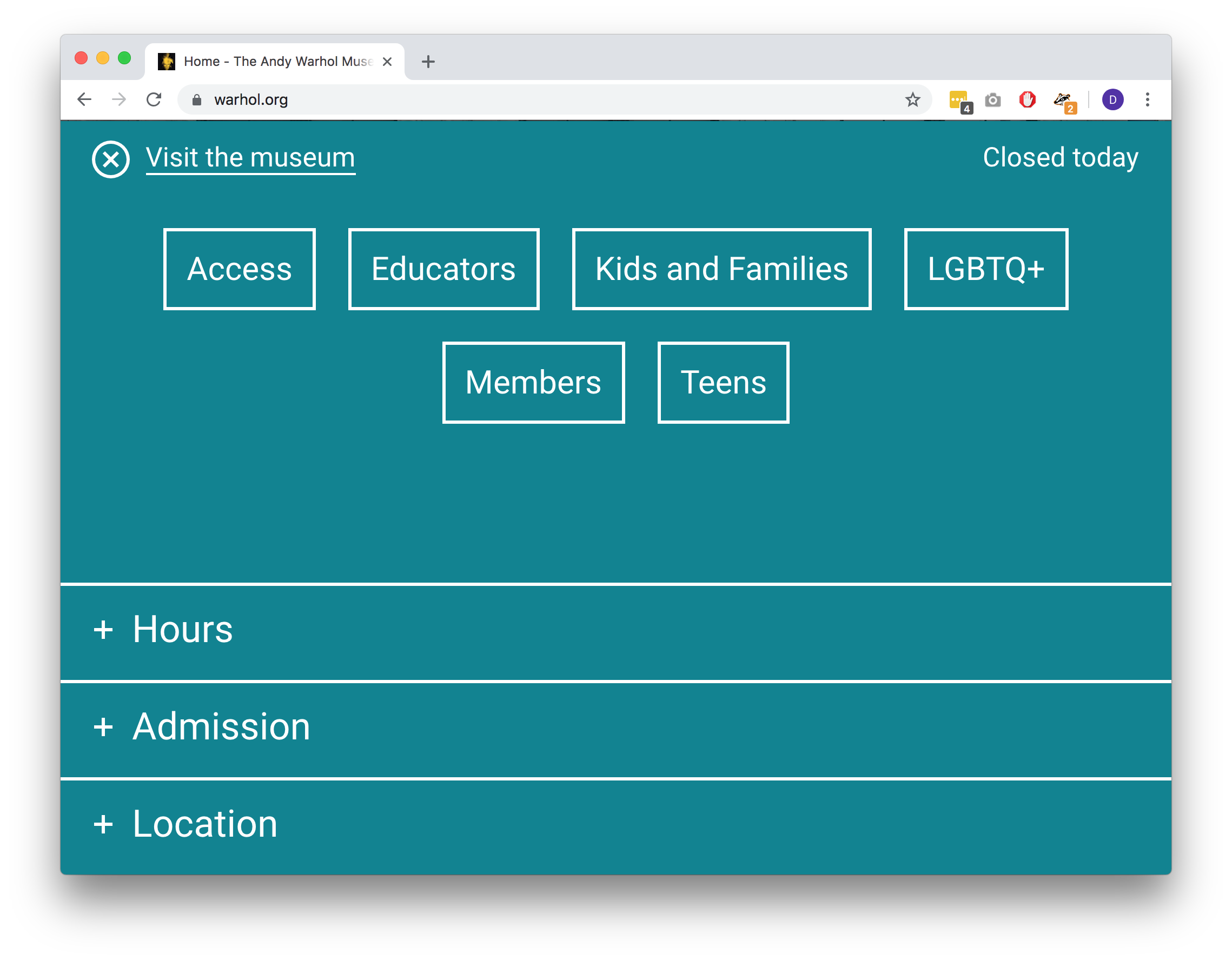
Our research revealed we needed to create diverse pathways for audiences to find information they need, and we implemented a design to do so. Most people who land on warhol.org are looking for basic visitor information, so we made this readily available from any page on the site—just toggle open the “Visit the museum” bar to view hours, learn about admission fees, or find directions to the museum. From here, audience groups with more specific needs—such as teens and educators—can dive deeper into pages tailored to their interests. These audience pathways became a great way to highlight resources for groups that are traditionally marginalized: we’ve surfaced information regarding people who have disabilities and people who identify as LGBTQ+, two groups we’re committed to serving through robust programming and accommodations.
In November 2017, I presented on how user research informed design decisions for warhol.org during the Museum Computer Network conference. Slides are available on Slideshare.
Press & accolades
The Warhol expands award-winning technology-based accessibility initiatives, Artdaily.org
Related
From Research to Action: Translating User Feedback into Digital Products panel on YouTube, featuring the warhol.org redesign
From Research to Action: Translating User Feedback into Digital Products slides on Slideshare